The Hidden Influence of Street Traffic Signs on Cities
How Color, Icons, and Design Shape Urban Clarity, Culture, and Potential Growth
Last weekend, I visited Buenos Aires and was immediately struck by its stunning urban design. The city’s century-old buildings, meticulously maintained, stand as a testament to a well-organized city with a clear sense of identity. Everywhere I looked, there was consistency that spoke of a city deeply connected to its past yet forward-looking in its planning, where modernity is intertwined with history.
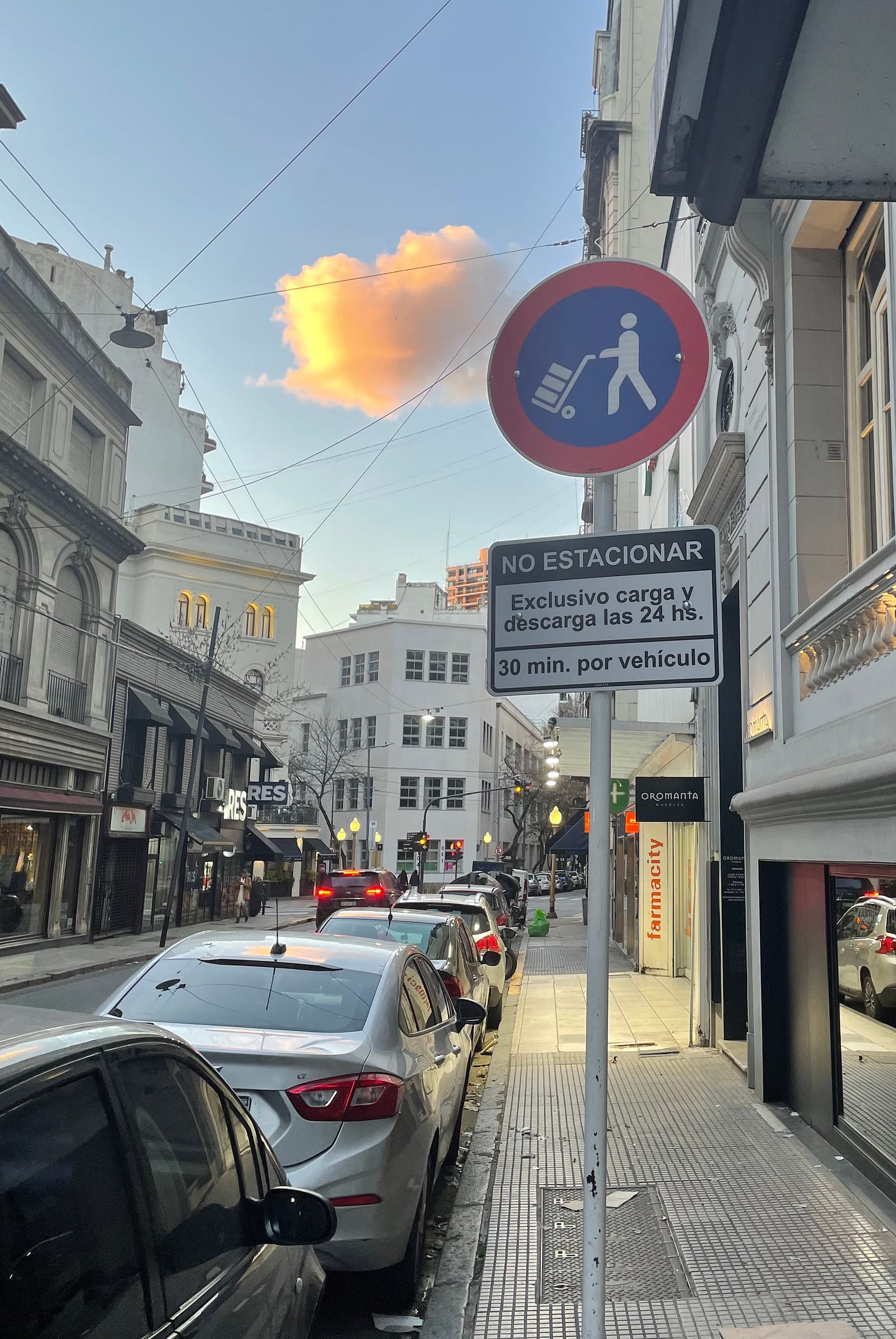
One aspect that particularly caught my attention were the traffic signs. Perhaps it’s my deep-seeded frustration with Chilean street signs, but these were beautiful — at least as far as street signs go. The iconography was clear, the colors were well-chosen, and the design was cohesive. These signs weren’t just functional; they were an integral part of the city’s visual landscape.
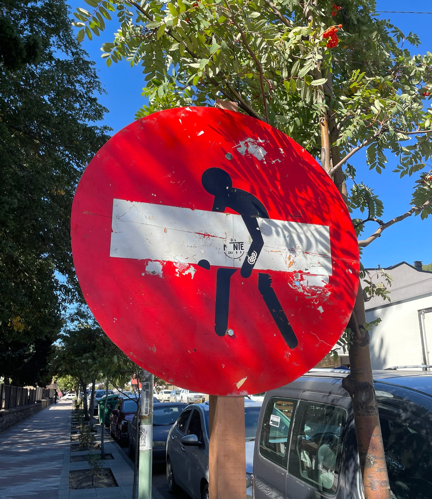
I had already been considering writing a blog post about reimagining Chilean street signs, because of a sign I saw in San Martín de los Andes, Argentina.
But I was gonna approaching my reflection from the perspective that "they are ugly everywhere." However, my experience in Buenos Aires showed me that this isn’t necessarily true. There are places where street signs not only serve their purpose but also contribute to the city’s overall aesthetic. It was one of the (many) reasons I felt I was in France. They not only influenced Buenos Aires beautiful (and extremely french) architecture, but there is also a very similar look to their road signs.

This experience really put my mind into 5th gear and I was ready to start designing some signs to replace the ones we have back home. But I hadn’t brought my laptop because I didn’t want to focus on work. I never not regret doing that, but I was itching to drop down my ideas. This was my sketch, to remember that there are many ways to make the same element.
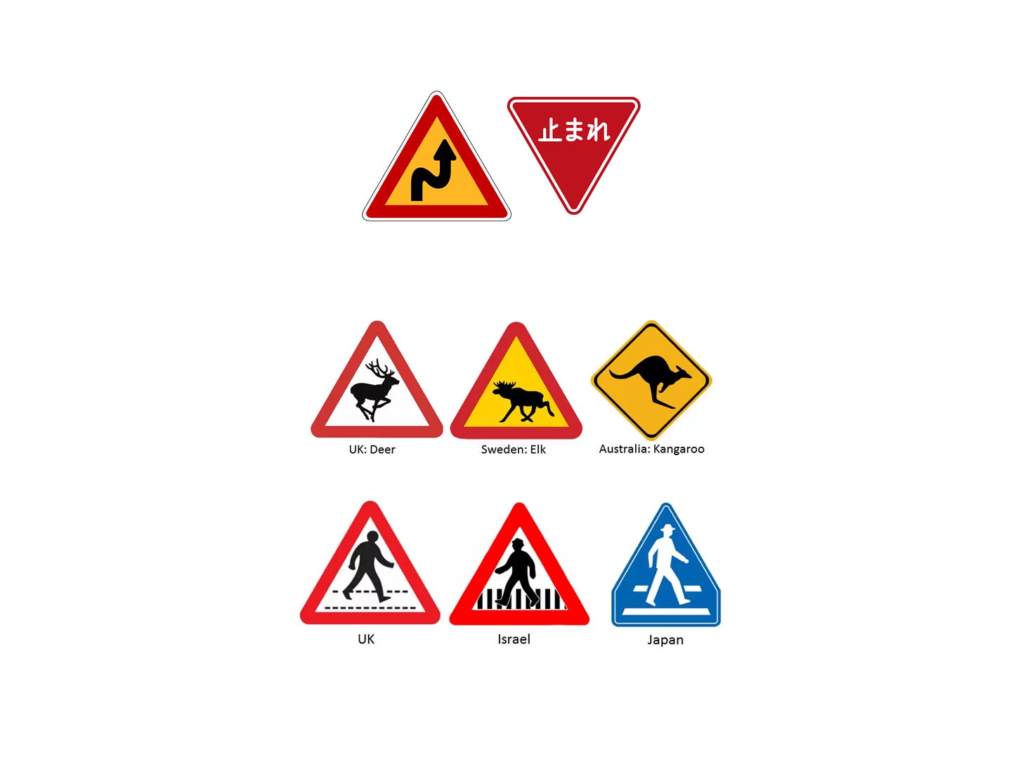
When I got back home from the mini vacation, I began researching. I discovered that many countries approach traffic signs differently — there isn’t a one-size-fits-all solution. And there isn’t a set of regulations that fits them all either.
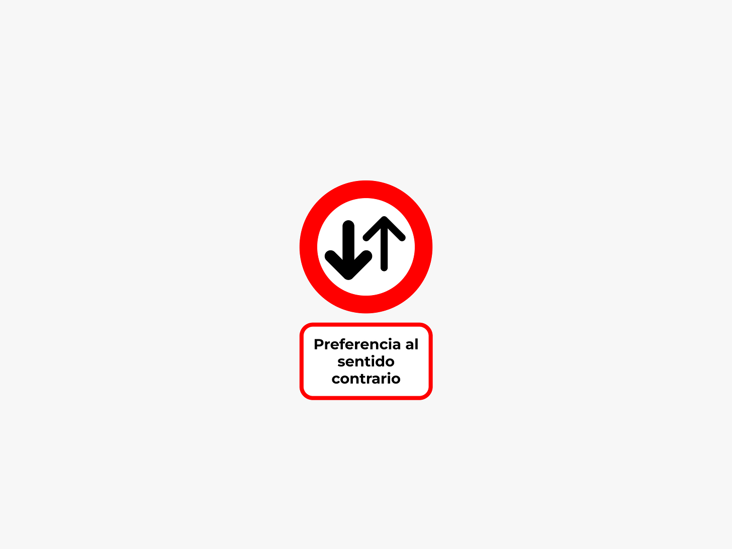
It would be weird to have a Kangaroo crossing sign in Chile. I had never even thought of a streets signs being yellow and red, before I saw the Sweden: Elk sign. This small look-through expanded so much more my thoughts into what would be played around with.
So I started designing.
Well actually, designing isn’t just designing. Usually we have a whole routine previous to actually designing anything, and that’s exactly what I did. I had already done a lot of research, getting inspiration from other road sign design systems I liked, and then I looked at our current set (for Chile).
I started nit-picking everything I did not like about them.
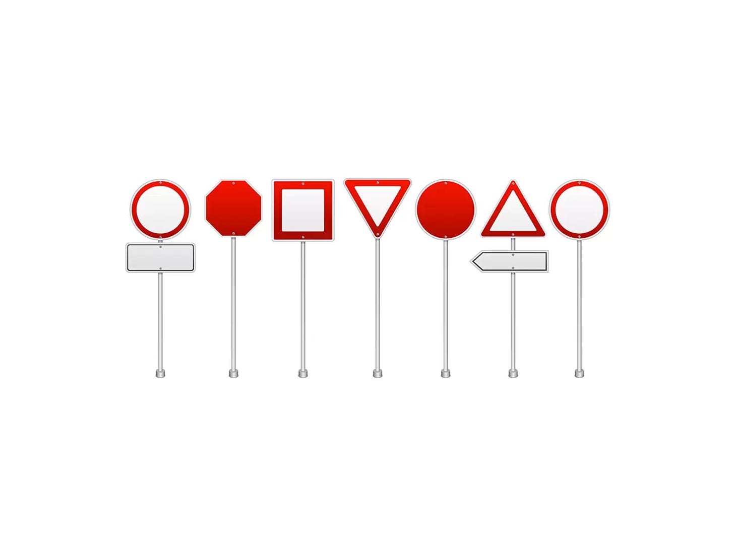
Then, I actually started designing. Or playing around as I like to call it. There were so many things to choose from. From stroke width, line colors, background colors, and even the sign shape.
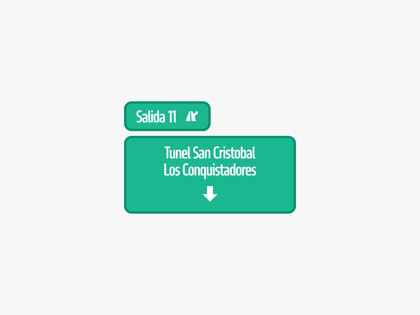
Another important aspect of designing street signs are typefaces. No one seems to play around with this, anywhere. It can have a significant impact on readability, and the few times I have seen one somewhat different, they look like this:
Tall and long typefaces are horrible for readability at a long distance. Even at a short distance. There are many sources that can help you find typefaces created for legibility, just as there are many typefaces created for a more creative functionality.
In this “playing around”, I wasn’t so interested in making this look good as much as I was just testing things I wouldn’t normally try.
While searching for icons, I stumbled upon a designer on the Noun Project whose icons seemed perfect for what I was needing. They also seemed eerily familiar. They closely resembled the ones I had admired in Buenos Aires. After some digging through his social links, I discovered that he’s Argentinian, now living in the U.S., and he likely did create the icons for the signs I saw during my trip.
It’s fascinating how everything is connected in some way. My experience in Buenos Aires not only inspired me to rethink Chilean street signs but also led me to connect with the very designer who might have been responsible for the signs that inspired me in the first place. This interconnectedness is a reminder of how design transcends borders and can influence us in unexpected ways.
In the end, I didn’t stray far from the original signs, and this was by design. There’s a crucial understanding we must always remember: people have a certain way of operating; they are accustomed to a system. Disrupting it too abruptly, especially when it’s not absolutely necessary, can lead to confusion and resistance.
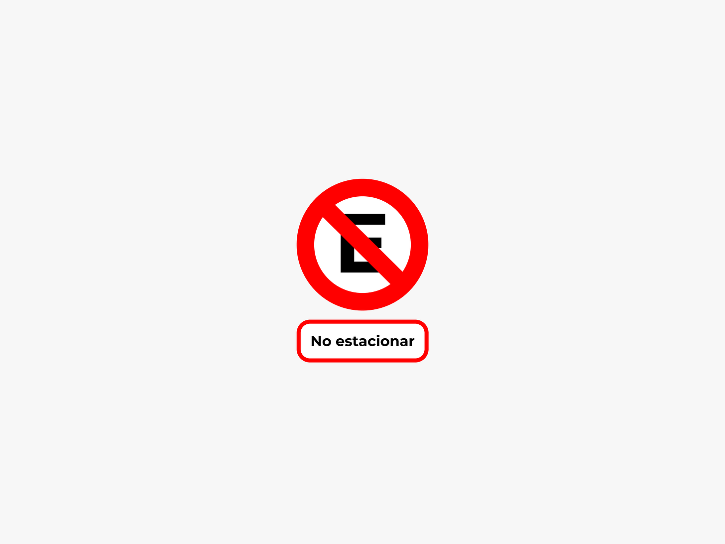
My goal wasn’t to reinvent anything, but to enhance what was already there. Blending familiar elements with improvements that make the system clearer, consistent and more aesthetically pleasing.
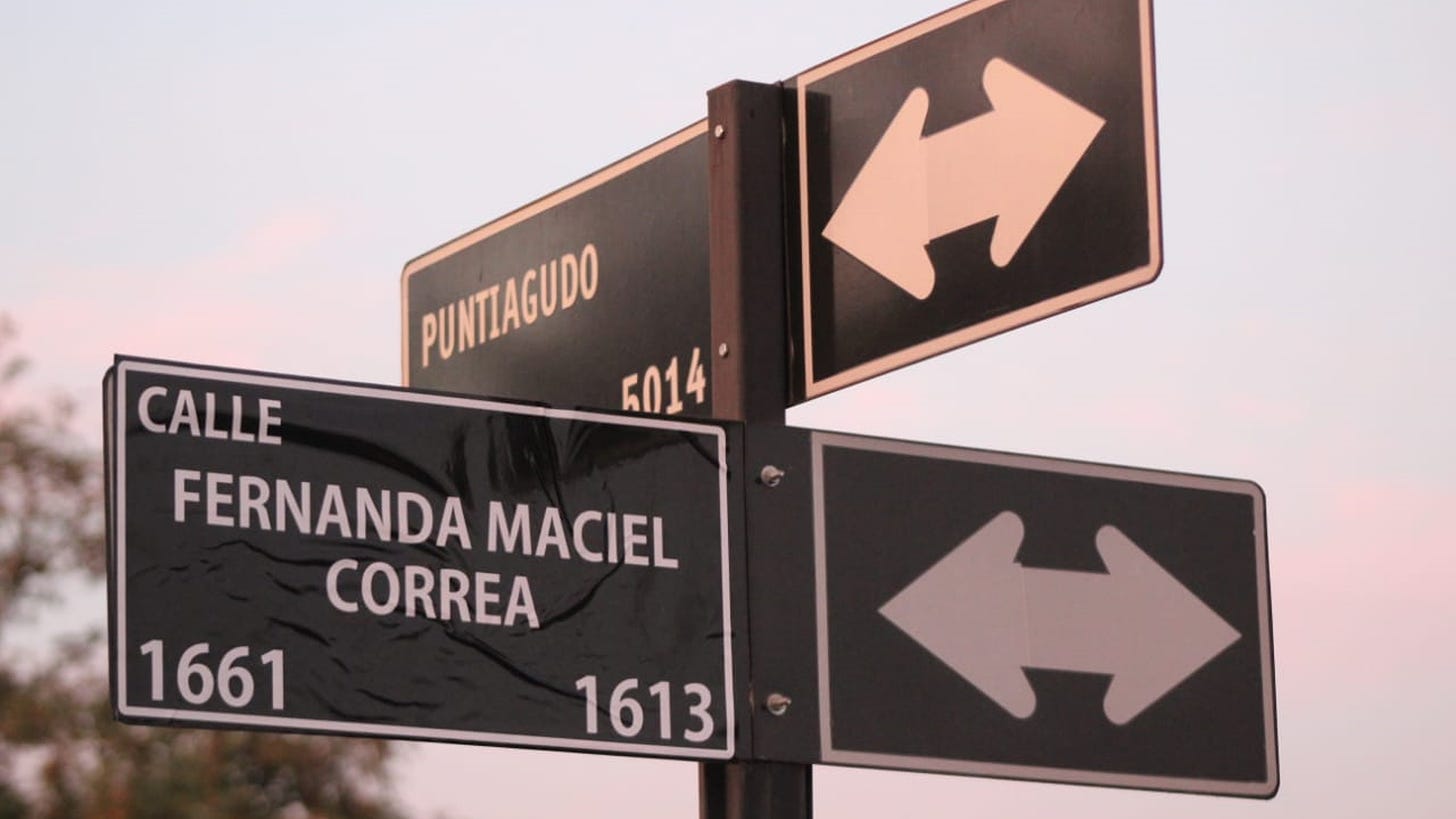
The one thing I didn’t get my hands on was redesigning street name signs. I truly believe we have the prettiest design out there for this particular category, and I didn’t want to even try to change it.
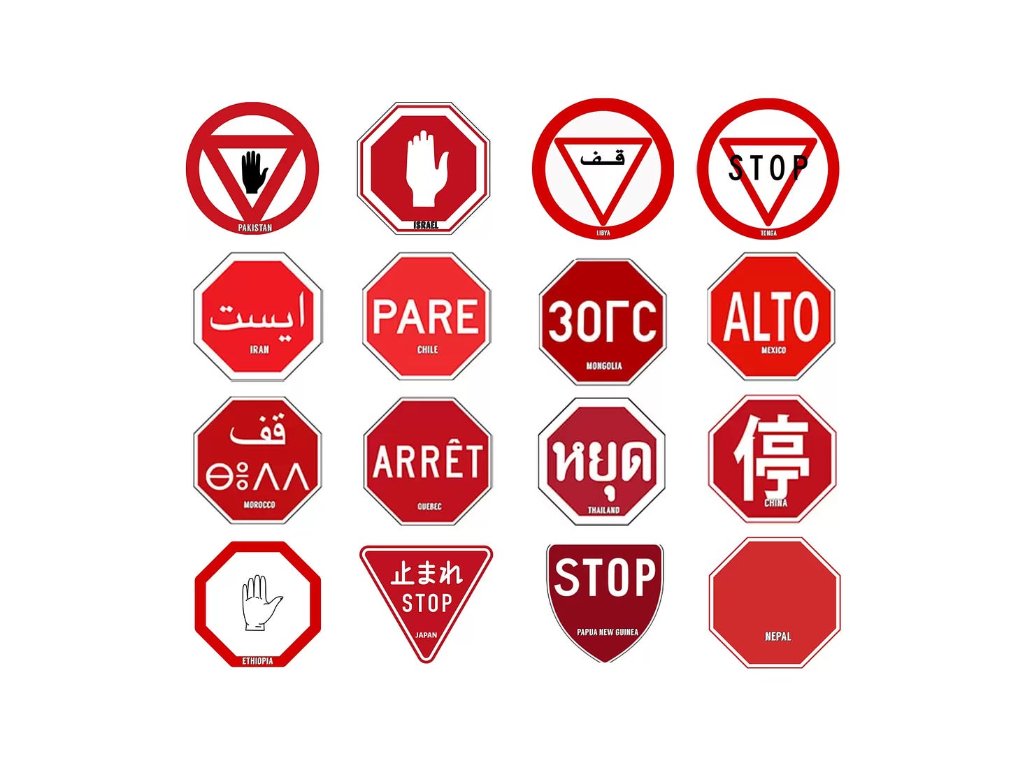
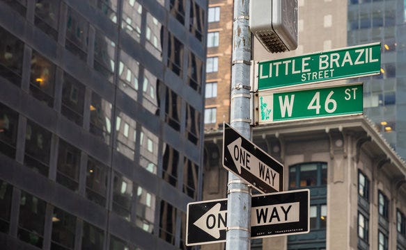
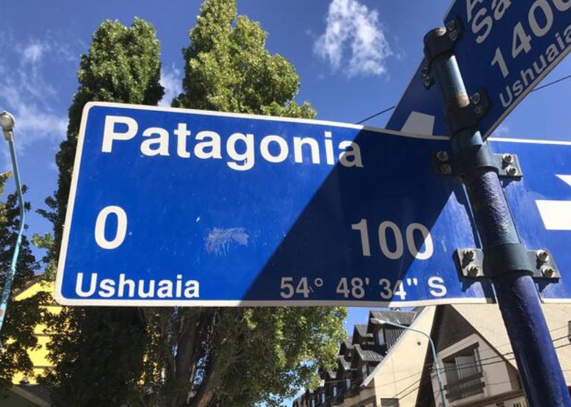
Sorry to other countries, but y’all got some janky ones out there. I’ll leave some out there, but I won’t name names.


